Welcome to the Data Science Survival Kit workshop! In this workshop, you will get a hands-on introduction to data science in JavaScript and Node.js.
What you'll learn
- How to use the stdlib REPL
- Where to find help and documentation
- What features and tools are available for working with data
- How to plot data
- How to generate pseudorandom numbers and associated statistical distributions
- How to perform statistical tests
- How to build a spam classifier
- How to perform kernel density estimation
What you'll need
- Internet access
- Basic understanding of HTML, CSS, and web development
- Intermediate understanding of JavaScript
- A modern browser (e.g., Chrome; preferably the latest version)
- Familiarity with browser developer tools, including the JavaScript console
Before beginning, help us better understand your motivations and skill level by completing this short anonymous survey.
Which statement best describes why you are taking this workshop?
How would you rate your experience with JavaScript?
How would you rate your experience with Node.js?
How would you rate your experience with data visualization?
How would you rate your experience with mathematics?
How would you rate your experience with statistics?
How would you rate your experience with machine learning?
Have you ever used Python for numeric computing (e.g., data analysis, machine learning, etc.)?
Have you ever used MATLAB for numeric computing (e.g., data analysis, machine learning, etc.)?
Have you ever used R for numeric computing (e.g., data analysis, machine learning, etc.)?
Have you ever used Julia for numeric computing (e.g., data analysis, machine learning, etc.)?
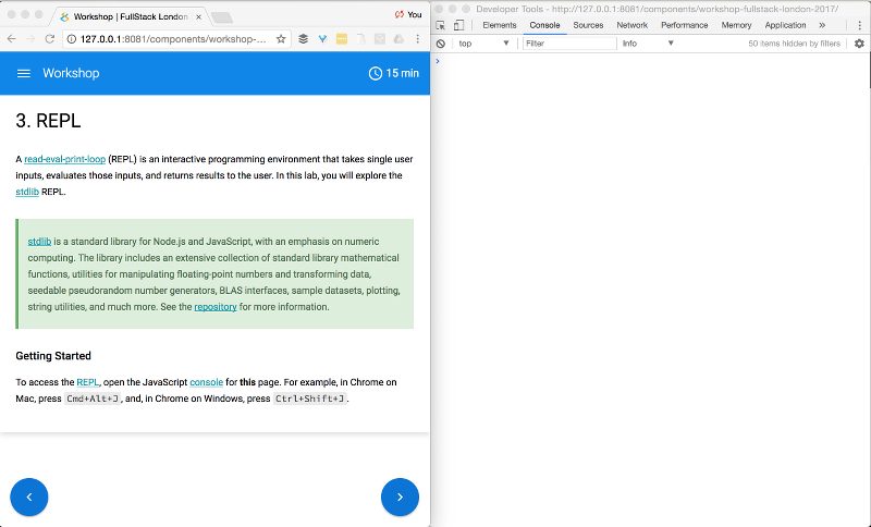
A read-eval-print-loop (REPL) is an interactive programming environment that takes single user inputs, evaluates those inputs, and returns results to the user. In this lab, you will explore the stdlib REPL.
Setup
To access the REPL, open the JavaScript console for this page.
Once the console is open, we recommend arranging the windows side-by-side to facilitate moving between this page and the console as you progress through the various exercises.
WARNING: refreshing the page will clear all REPL history.
Getting Started
If you are unfamiliar with the console, the console provides an interactive environment for running JavaScript in the browser. Try entering the following in the console window:
2 + 2
When you press enter, the console will read the input, evaluate the input, and print the results.
> 2 + 2
4
stdlib augments the console by exposing all library functionality within the global namespace. For example, to compute the error function for 1.5
> base.erf( 1.5 )
0.9661051464753108
Or to get the current time (in seconds) since the Unix epoch
> now()To list library functionality, enter
> namespace()Help
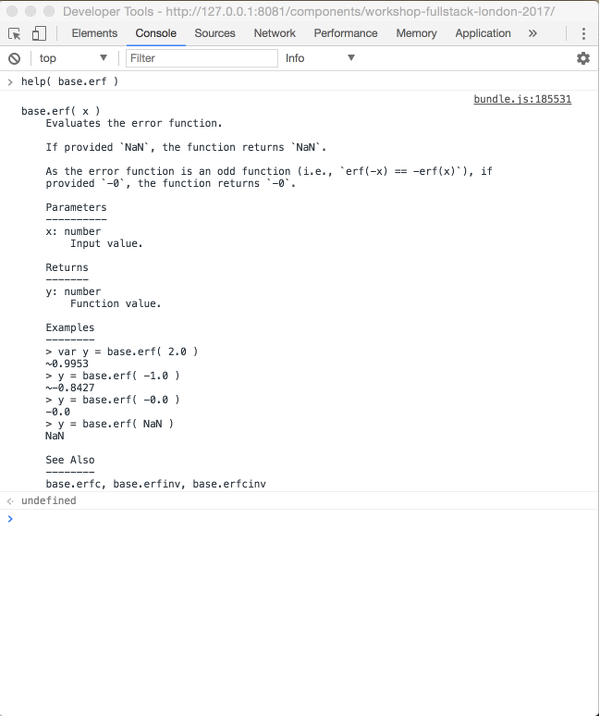
One of the key features of stdlib is the inclusion of REPL help documentation, which is accessed via the help() command.
For example, to access the help documentation for base.erf
> help( base.erf )All REPL help documentation follows the same general structure, providing examples, related functionality, and top-level, parameter, and return value descriptions.
The functions alias2pkg() and pkg2alias() can be used to retrieve the package corresponding to a given REPL alias and vice versa. For example, to obtain the package for the FEMALE_FIRST_NAMES_EN dataset, call
> alias2pkg( FEMALE_FIRST_NAMES_EN )
Conversely, let's say you have been looking at the project documentation for @stdlib/utils/group-by. You can find the corresponding REPL alias via
> pkg2alias( '@stdlib/utils/group-by' )Exercises
- Familiarize yourself with REPL functionality by viewing the help documentation for a variety of exposed functions.
-
Based on the example for
countBy(), count the number of names in theFEMALE_FIRST_NAMES_EN()dataset which begin with a given letter. The result should be an object with letters as keys (e.g.,a,b,c,d, ...) and counts as values. -
Similar to the previous exercise, use the
groupBy()function to group names according to first letter. -
Similar to the previous exercise, use the
tabulateBy()function to generate a frequency table of first letter occurrences.
Survey
How often do you use the JavaScript console?
What is your primary reason for using the JavaScript console?
How often do you use the Node.js REPL?
What is your primary reason for using the Node.js REPL?
Did you find this lab useful?
How do you feel about the length of this lab?
Apart from the final exercises, how difficult did you find this lab?
How difficult did you find the exercises for this lab?
Are you more likely to use the JavaScript console after completing this lab?
Are you more likely to use the Node.js REPL after completing this lab?
A plot is a graphical technique used to represent a data set. The most common representation is a graph showing the relationship between two or more variables.
Plots are critical for gaining insight into data sets. Plots facilitate testing assumptions, selecting and validating models, identifying relationships, detecting outliers, and communicating results. And importantly, plots as statistical graphics (i.e., graphs which visualize quantitative data) provide insight into the underlying structure of data.
Statistical graphics have four main objectives:
- Exploration
- Communication
- Validation
- Structural Insight
In this lab, you will use the stdlib to generate plots and explore data.
Getting Started
To begin, we need to create some simple data sets (feel free to use your own numeric values).
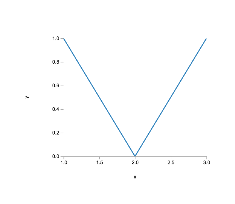
> var x = [ 1, 2, 3 ];
> var y = [ 1, 0, 1 ];
Now that we have some data, let us plot it! To do so, we must first create a plot instance.
> var plt1 = plot( [x], [y] )At this point, nothing is rendered. To render the plot,
> var vtree = plt1.render()
The output of the render() method is Virtual DOM, which is a declarative way of representing the DOM.
To generate HTML, we need to use vdom2html(), which translates Virtual DOM to HTML.
> var html = vdom2html( vtree )Now that we have rendered our plot and generated HTML, we need to generate the view (i.e., insert the plot into our page). To do so, we must first select the element into which we want to insert our plot. For convenience, we have already created a placeholder element. To select the element,
> var el1 = document.querySelector( '#basic-plot' )To insert the plot,
> el1.innerHTML = html
The plot view should look similar to the following (assuming the same data):
Plot Types
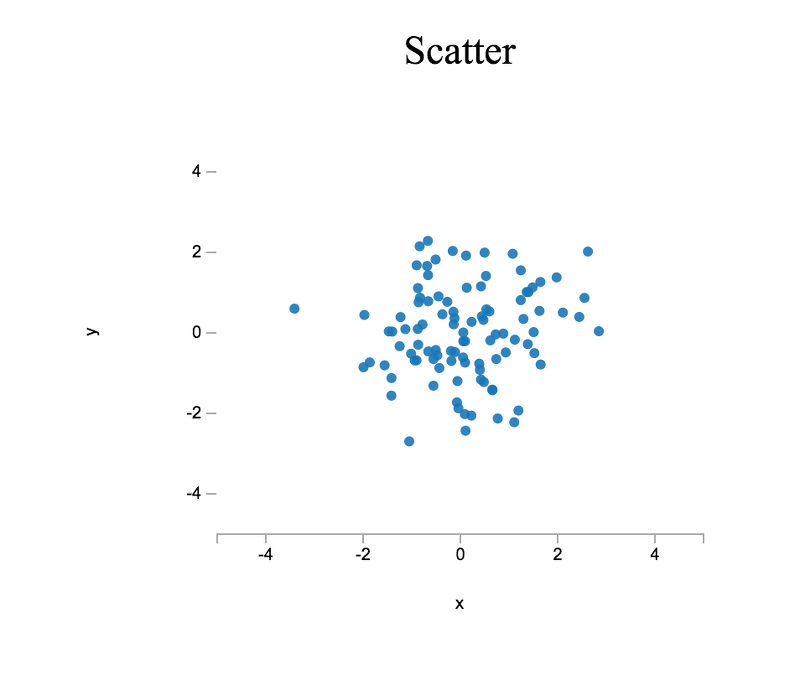
In order to better familiarize ourselves with the plot API, let us create a few customized plots. As before, we will create some data, but this time we will generate random data using base.random.randn(), which is a pseudorandom number generator (PRNG) for generating normally distributed pseudorandom numbers (i.e., numbers which, when combined in aggregate, form a bell-shaped curve).
> var x = new Float64Array( 100 );
> var y = new Float64Array( 100 );
> inmap( x, base.random.randn );
> inmap( y, base.random.randn );
And, as before, we will create a new plot using the plot() function.
> var plt2 = plot( [x], [y] );
We can customize the plot instance by setting various plot properties. For instance, to set the plot title, we set the title property.
> plt2.title = 'Scatter';To generate a scatter plot rather than a line chart (see above), we disable the plot line style and specify a plot symbol (i.e., a visual encoding for each datum).
> plt2.lineStyle = 'none';
> plt2.symbols = 'closed-circle';
By default, a plot "hugs" the data, meaning that axis limits are defined by the minimum and maximum data values along a given axis. To override this behavior, we can set plot properties which explicitly define axis limits.
> plt2.xMin = -5.0;
> plt2.xMax = 5.0;
> plt2.yMin = -5.0;
> plt2.yMax = 5.0;
Similar to before, we will render our plot, use vdom2html() to generate HTML, select a DOM element into which we want to insert our plot, and then inject the rendered HTML.
> var el2 = document.querySelector( '#scatter-plot' );
> el2.innerHTML = vdom2html( plt2.render() );The plot view should look similar to the following:
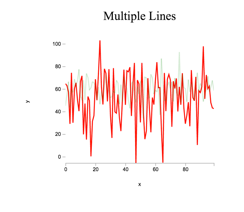
For our next plot, let us try plotting multiple lines. Instead of a single x and y, we will want to generate multiple datasets. Similar to before, we can generate normally distributed pseudorandom data, but this time we will use base.random.normal() to draw pseudorandom numbers from a normal distribution with mean μ and standard deviation σ.
> var x = new Int8Array( 100 );
> inmap( x, function ( v, i ) { return i; } );
> var y1 = new Float64Array( x.length );
> var y2 = new Float64Array( x.length );
> inmap( y1, function () { return base.random.normal( 50.0, 20.0 ); } );
> inmap( y2, function () { return base.random.normal( 60.0, 10.0 ); } );
In the above, we generate a single x vector, which can be reused when plotting against y1 and y2. Now that we have data to plot, we can create a plot instance and customize accordingly, specifying properties for each data series.
> var plt3 = plot( [x,x], [y1,y2] );
> plt3.title = 'Multiple Lines';
> plt3.lineStyle = [ '-', ':' ];
> plt3.lineOpacity = [ 0.9, 0.3 ];
> plt3.colors = [ 'red', 'green' ];
To plot the data, we select the placeholder DOM element and insert the rendered HTML.
> var el3 = document.querySelector( '#multiple-line-plot' );
> el3.innerHTML = vdom2html( plt3.render() );The plot view should look similar to the following:
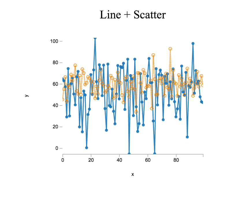
We can also combine plot types. For our next plot, let us combine a line chart with a scatter plot. Using the same data from the multiple line plot,
> var plt4 = plot( [x,x], [y1,y2] );
> plt4.title = 'Line + Scatter';
> plt4.lineStyle = [ '-', ':' ];
> plt4.symbols = [ 'closed-circle', 'open-circle' ];
> var el4 = document.querySelector( '#line-scatter-plot' );
> el4.innerHTML = vdom2html( plt4.render() );The plot view should look similar to the following:
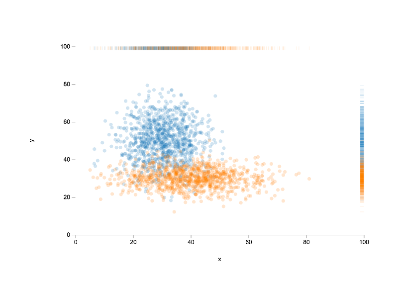
As a last exercise, let us create another combination plot. This time we will combine a scatter plot with a rug plot. A rug plot provides a compact 1-dimensional visualization to supplement higher dimensional plots by displaying a marginal distribution along one axis.
Reusing the y1 and y2 data from above, we can proceed as follows
> var plt5 = plot( [y1], [y2] );
> plt5.title = 'Scatter + Rug';
> plt5.xLabel = 'y1';
> plt5.yLabel = 'y2';
> plt5.lineStyle = 'none';
> plt5.symbols = 'closed-circle';
To help us better compare the shapes of the two datasets, we want equal axis limits (i.e., both datasets should be plotted on the same scale); otherwise, we might draw incorrect conclusions when comparing the data distributions.
> plt5.xMin = -10.0;
> plt5.xMax = 110.0;
> plt5.yMin = -10.0;
> plt5.yMax = 110.0;
Finally, we want to display rug plots for both axes (i.e., plot marginal distributions for both datasets). In which case, we need to toggle the relevant plot properties.
> plt5.xRug = true;
> plt5.yRug = true;
At this point, we are ready to render! To do so, we proceed as we have done previously.
> var el5 = document.querySelector( '#scatter-rug-plot' );
> el5.innerHTML = vdom2html( plt5.render() );The plot view should look similar to the following:
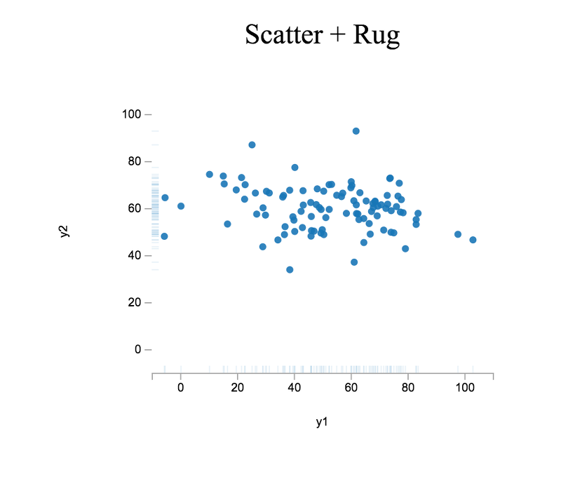
As you may observe, y1 is more disperse than y2, which is concisely conveyed by the rug plots displayed along both axes.
Exercises
-
Recreate the figure displayed at the beginning of this lab, plotting into the element
#plot-exercise-1provided below.
Figure #plot-exercise-1: Plot for exercise 1. -
Plot Anscombe's quartet
ANSCOMBES_QUARTET(), using the element#plot-exercise-2provided below. In what ways are the datasets similar and in what ways are the datasets different?
Figure #plot-exercise-2: Plot for exercise 2. Compute the sample mean and sample variance for each dataset (note: write your own functions for computing the sample mean and sample variance). Are the datasets distinguishable based on statistics alone? Why or why not? If not, do statistical measures exist which could differentiate between the datasets? And how would visualizing the datasets help to determine which measures to use?
-
Plot the Federal Reserve Bank wage rigidity dataset
FRB_SF_WAGE_RIGIDITY(), using the element#plot-exercise-3provided below. Note that this dataset has missing data.
Figure #plot-exercise-3: Plot for exercise 3.
Survey
How often do you plot data?
Did you find this lab useful?
How do you feel about the length of this lab?
Apart from the final exercises, how difficult did you find this lab?
How difficult did you find the exercises for this lab?
Are you more likely to plot data after completing this lab?
A probability distribution is a description of the relative frequency in which each possible outcome will occur in an experiment. For example, if a random variable X denotes the outcome of a coin toss (the experiment), then the probability distribution of X is 0.5 that X is heads and 0.5 that X is tails (assuming a fair coin; i.e., a coin in which both sides are equally probable).
The study of probability distributions is important because probability distributions allow us to concisely model data in mathematical terms. Once modeled, we are able to generate hypotheses, conduct statistical tests to test those hypotheses, and perform statistical inference.
In the previous lab, we generated normally distributed data. In this lab, we will continue to explore this and other distributions.
Histograms
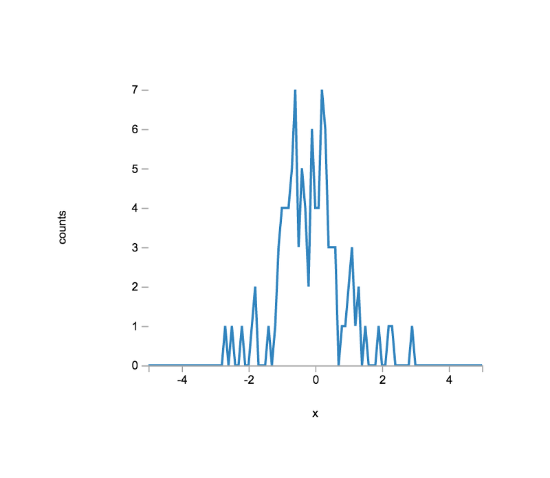
One of the most commonly used distributions for modeling data is the normal distribution. To help us better understand its properties, let us begin by generating pseudorandom numbers drawn from a normal distribution with a known mean and standard deviation.
> var N = 100; // number of observations
> var data = new Float64Array( N );
> inmap( data, function () { return base.random.normal( 0.0, 1.0 ); } );
To see the shape of our data, we can construct a histogram, in which we "bin" each observation and count the number of observations for each bin.
In order to place our data in bins having a width of 0.1, we can first use the function base.roundn() to round each observation to a specified number of decimal places. For bin widths of 0.1, we want to round to the first decimal.
> inmap( data, function ( d ) { return base.roundn( d, -1 ); } );Currently, the data array is unordered, and, if ordered, would probably contain "gaps", in which a bin (i.e., rounded value) does not have any observations and thus is not present in the array. To transform our data array into a dense representation, we can proceed as follows. First, we define the expected bin domain.
> var bmin = -5.0;
> var bmax = 5.0;
where bmin and bmax represent the leftmost bin location (center) and the rightmost bin location (center), respectively. Now that we have defined our bin domain, we can compute the number of bins as follows:
> var bwidth = 0.1;
> var nbins = ((bmax-bmin) / bwidth) + 1;
You can convince yourself of the bin formula by considering the bin vector: {0, 1, 2, 3}, where 0 and 3 are the leftmost and rightmost bin centers, respectively. If we apply the formula above, we recover the vector length, as expected.
Now that we have the number of bins, we can initialize a vector which will contain the bin counts for each bin in the expected domain.
> var counts = new Int32Array( nbins );
Next, when determining bin counts, we need to define a method which allows us to efficiently determine a value's bin index. By this we mean, if given the observation -0.1, what is the array index in the counts vector for the bin whose count we want to update? Building on the formula above for nbins, we can define the following function:
> function bidx( bmin, bwidth, v ) { return base.round( base.abs(bmin-v) / bwidth ); };
To convince yourself of the index formula, consider the edge cases -5.0 and 5.0. If v = -5.0, the computed index is 0, which corresponds to the leftmost bin. If v = 5.0, the computed index is 100, which corresponds to the rightmost bin. As an exercise, compute the indexes for -4.8 and 4.8 and confirm that the returned index is correct.
Now that we have a means for computing a bin index, we can populate our counts vector by iterating over our data array and updating the corresponding count.
> var idx, i;
> for ( i = 0; i < data.length; i++ ) {
		idx = bidx( bmin, bwidth, data[ i ] );
		counts[ idx ] += 1;
};
In order to plot the data, we need to construct a bin vector, which will be plotted along the x-axis, covering the expected bin domain; i.e., -5.0, -4.9, ..., 4.9, 5.0.
> var bcenters = new Float64Array( nbins );
> var bc;
> for ( i = 0; i < nbins; i++ ) {
    bc = bmin + (bwidth*i);
    bcenters[ i ] = base.roundn( bc, -1 );
};
To plot the data, we proceed as we did in the previous lab.
> var plt1 = plot( [bcenters], [counts] );
> plt1.xLabel = 'x';
> plt1.yLabel = 'counts';
> var el = document.querySelector( '#histogram-normal-1' );
> el.innerHTML = vdom2html( plt1.render() );The plot view should look similar to the following:
To see how well the empirical distribution matches the expected distribution, let us first generate an (approximated) expected distribution using base.dists.normal.pdf().
> var expected = new Float64Array( bcenters.length );
> forEach( bcenters, function ( x, i ) {
    var density = base.dists.normal.pdf( x, 0.0, 1.0 );
    expected[ i ] = N * bwidth * density;
});We can now update the plot to show both the empirical and expected distributions.
> var plt2 = plot( [bcenters,bcenters], [counts,expected] );
> plt2.xLabel = 'x';
> plt2.yLabel = 'counts';
> var el = document.querySelector( '#histogram-normal-overlay-1' );
> el.innerHTML = vdom2html( plt2.render() );The plot view should look similar to the following:
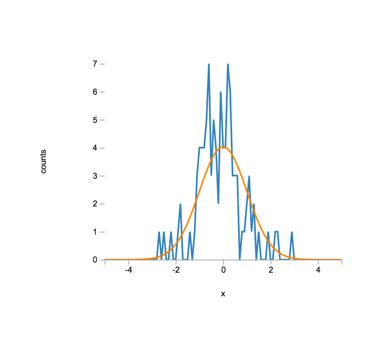
How well do you think the empirical distribution resembles the expected distribution? How would you explain discrepancies between the empirical and expected distributions?
Exercises
-
Based on the approached outlined above, create a function for generating a histogram from an input data array. The function should have the following signature:
hist( data, bmin, bmax, bwidth )Test your function by plotting into the element
#histogram-exercise-1provided below.
Figure #histogram-exercise-1: Plot for exercise 1. -
Repeat the generation of the empirical and expected distribution, but increase the number of observations. Insert your plot into the element
#histogram-exercise-2provided below.
Figure #histogram-exercise-2: Plot(s) for exercise 2. -
Investigate other distributions; e.g.,
base.random.beta()
base.dists.beta.pdf()

base.random.laplace()
base.dists.laplace.pdf()

base.random.exponential()
base.dists.exponential.pdf()
Insert your plots into the element
#histogram-exercise-3provided below.
Figure #histogram-exercise-3: Plot for exercise 3.
Survey
Did you find this lab useful?
How do you feel about the length of this lab?
Apart from the final exercises, how difficult did you find this lab?
How difficult did you find the exercises for this lab?
Comparing an outcome between two (or more) groups is a very common statistical task. Hypothesis tests help us to assess whether a difference is statistically significant.
Imagine the following scenario: you have two landing pages for your website and would like to know which one is more effective in converting visitors. Suppose you have collected the following two data sets, where a 1 denotes that a visitor signed up and a 0 denotes that a visitor left the page without taking any action.
> var page1 = [
    1, 0, 0, 0, 0, 0, 1, 0, 0, 1,
    0, 0, 0, 1, 0, 0, 0, 1, 0, 0,
    0, 1, 1, 0, 0, 0, 0, 0, 0, 0
];
> var page2 = [
    0, 0, 0, 0, 0, 0, 0, 0, 0, 0,
    0, 0, 0, 0, 0, 0, 1, 0, 0, 0,
    0, 0, 0, 0, 0, 0, 0, 1, 0, 0
];
A cursory look at the data suggests that the first page is more effective at converting users. To be a bit more quantitative, let us calculate the proportion of users (mean) who signed up per page using the reduce() function.
> function sum( acc, v ) { return acc + v; };
> var sum1 = reduce( page1, 0, sum )
7
> var sum2 = reduce( page2, 0, sum )
2
> var mu1 = sum1 / page1.length
0.23333333333333334
> var mu2 = sum2 / page2.length
0.06666666666666667
Pretty striking difference, right?
While the difference in means seems large, is the difference also statistically significant? Let us find out!
To test for statistical significance, we can use ttest2() command.
> var out = ttest2( page1, page2 )
The returned test result has a rejected property which is a boolean indicating whether the null hypothesis of the test was rejected. The null hypothesis, which is often denoted H0, denotes the case where a difference is not statistically significant. The alternative hypothesis, which is often denoted H1, denotes the case where a difference is statistically significant.
For pretty-printed output, use the out.print() method, which will print the exact definition of the alternative hypothesis.
> out.print()Based on the test results, do we conclude that the first page or the second page is more effective at converting visitors?
Observe that the test decision has an inherent uncertainty; i.e., a small probability exists that you might have reached a false conclusion. How large is this probability?
When all test assumptions are satisfied, the significance level of a test, commonly denoted by the Greek letter α, informs you as to the probability that you reject the null hypothesis even though the null hypothesis is true. Hypothesis testing gives us only this guarantee and does not provide any guarantees when we fail to reject a false null hypothesis.
Simulation Study
We can decide whether a null hypothesis should be rejected by using the p-value of a statistical test. A smaller p-value indicates that a hypothesis fails to adequately explain the data. As a decision rule, we reject the hypothesis whenever the p-value is lower than the chosen significance level α, which, by convention, is often set to 0.05.
Recall that α denotes the probability that you reject the null hypothesis even though the hypothesis is true. By fixing α at 0.05, we are basically saying that we are content with erroneously rejecting the null hypothesis in 5% of the cases.
Why is α equal to this error probability? We can mathematically prove that, if the null hypothesis is true, then the p-value follows a uniform distribution on the interval [0,1]. Hence, over the course of many experiments, we would expect 5% of p-values to be smaller than 0.05. Instead of a mathematical proof, let us simulate some data to confirm that this is indeed the case.
We will consider the hypothesis that the true mean of a distribution from which we observe data is equal to zero. For this purpose, we may use the ttest function, which can perform a one-sample t-test. We will generate data from a normal distribution with zero mean and some known standard deviation σ (e.g., σ = 3):
> var arr = new Array( 300 );
> inmap( arr, function () { return base.random.normal( 0.0, 3.0 ); } );
We then run the t-test and extract the p-value. To be able to repeat this process many times, let us wrap everything inside a function:
> function simulate( size ) {
    var arr = new Array( size );
    inmap( arr, function () { return base.random.normal( 0.0, 3.0 ); } );
    var out = ttest( arr );
    return out.pValue;
}
Now create a sufficiently large array (at least a few hunded observations) and populate it with p-values generated from this function, say, for size = 100. Calculate the proportion of array elements that are smaller than 0.05. Is this proportion reasonably close to 0.05, as we would expect? Repeat the whole process a few times to see how the results vary.
To formally test whether the generated p-values are drawn from a uniform distribution between zero and one, we can use the Kolmogorov-Smirnov test, a test which can be used more generally whenever one wants to test a sample against a continuous reference distribution. In stdlib, the Kolmogorov-Smirnov test is implemented as kstest(). Make yourself familiar with its usage help( kstest ) and then use it to assess our claim.
The t-test is based on the assumption that data originates from a normal distribution. If this assumption is violated, t-test results may not be trusted under certain circumstances. We will explore this issue in the exercises.
Exercises
-
Write a new
simulate()function for using the t-test when the data is generated from aGamma(1,2)distribution.base.random.gamma()Instead of testing against a mean of zero, use the
muoption ofttest()to test against the correct mean.Repeat this for different values of
sizeand verify that the t-test breaks down when one has a skewed distribution such as theGamma(1,2)and only small sample sizes. -
Instead of using the p-value to conduct one's tests, one can alternatively look at a confidence interval for the parameter of interest. Confidence intervals are often used to convey uncertainty in model estimates, since they are useful even when one does not have a concrete hypothesis one wishes to test.
For a 1-α confidence interval, one has the guarantee that, for a large number of such confidence intervals, 1-α of them will contain the true parameter. Verify this behavior by repeatedly simulating data from a normal distribution with zero mean, extracting the confidence intervals from a t-test, and showing that they contain zero around 1-α of the cases.
Notice that, while in reality we are not going to repeat a specific test multiple times, we will likely conduct many different tests over a long period of time. If we conduct them all at a significance level α, we can be certain that 1-α of them contain the true value (provided all test assumptions are valid).
Survey
Did you find this lab useful?
How do you feel about the length of this lab?
Apart from the final exercises, how difficult did you find this lab?
How difficult did you find the exercises for this lab?
We are all plagued by the spam emails that arrive in our mailboxes each day. Flagging emails as spam is what we call a classification task, since it consists of assigning an observation into one of several categories (spam/no spam). In this lab, we will explore building our own spam classifier using a simple but well-performing statistical technique called Naive Bayes.
For this purpose, we will make use of the SPAM_ASSASSIN data set that ships with stdlib. We can load a copy of it and assign it to the variable spam as follows:
> var spam = datasets( 'SPAM_ASSASSIN' );Take a few minutes to familiarize yourself with the data set (you might also want to read its documentation).
For this lab, the emails from the easy-ham-1 and spam-2 batches will serve as our training set, from which we will build a model that can then predict whether a new email should be classified as spam. To evaluate the performance of a statistical model, it is common practice to set aside a test set of observations for which we know the true class, but which we hold out and do not use while building our model. This ensures that we get an unbiased estimate of how well the model will generalize once we evaluate it on our test set. Here, the emails from spam-1, hard-ham-1, and easy-ham-2 will constitute our test set.
Let's store all observations belonging to the training set in a new array, as follows:
> var training = []
> for ( var i = 0; i < spam.length; i++ ) {
    if ( spam[i].group === 'easy-ham-1' || spam[i].group === 'spam-2' ) {
        training.push( spam[i] );
    }
}
When you looked at some of the emails, you will have noticed that these always include meta-information of the emails before the actual content. The following function helps us to strip off this part and also removes other unwanted character sequences from the emails:
> function extractBody( email ) {
    // Remove the meta-information before two initial line breaks:
    var LINE_BREAK_REGEXP = /[\r\n]{2}([\s\S]*)$/;
    var text = email.match( LINE_BREAK_REGEXP )[ 1 ];
    // Turn to lowercase such that a word is treated the same no matter its case:
    text = lowercase( text );
    // Expand contractions, e.g. don't => do not:
    text = expandContractions( text );
    text = removePunctuation( text );
    // Remove numbers and other special characters:
    text = text.replace( /[0-9\-\+]/g, '' );
    // Remove common words such as "the" or "and":
    text = removeWords( text, STOPWORDS );
    return text;
}
Before we are able to call this function, we need to load the list of stopwords that will be removed. Since our texts are in English, we will load a list of commonly used English words, but stdlib comes with stopword lists for many other languages as well.
> var STOPWORDS = datasets( 'STOPWORDS_EN' );
You should now be able to call extractBody() on any of the spam texts. For example, try extractBody( spam[ 0 ].text ) to look at the transformed text for the first mail. A large part of building a statistical model is the selection of variables that are useful in predicting the outcome of interest. In our case, we will just use the words appearing in the texts, but observe that we may throw away useful information by doing so. For example, we might speculate that spam mails contain more capitalized or uppercased words in order to grab the attention of the recipients.
Our Naive Bayes model relies on a so-called bag-of-words representation of the documents in our data set. To generate this representation, we will tokenize our texts, i.e. split them up into pieces (the so-called tokens).
We can use the tokenize function for this task. With these functions equipped, let us now extract the tokens for the texts in our training set, using inmap() to perform an in-place map operation.
> training = inmap( training, function( x ) {
    x.body = extractBody( x.text );
    x.tokens = tokenize( x.body );
    return x;
});
Before building our model, let us explore the frequency differences for the tokens in both the spam and non-spam groups and find which ones help in discriminating between the two classes. For this purpose, we will divide our training data into two parts, and then lump the tokens from all their documents together into a single array, which we can then count to obtain the frequencies of the tokens in each group. We can use the groupBy function to group our training data into the two groups as follows:
> var grouped = groupBy( training, function( x ) {
    if ( x.group === 'spam-2' ) {
        return 'spam';
    }
    return 'nospam';
});
We can now lump all tokens from texts belonging to either group together, for example by using the following code:
> var spamTokens = pluck( grouped.spam, 'tokens' );
> spamTokens = flattenArray( spamTokens );
> var nospamTokens = pluck( grouped.nospam, 'tokens' );
> nospamTokens = flattenArray( nospamTokens )
Let us use the countBy function to calculate the frequencies. Notice that we supply the identity function as the second argument since we want to group the array elements by their actual values.
> var spamFreqs = countBy( spamTokens, identity );
> var nospamFreqs = countBy( nospamTokens, identity );
With this convenient representation in hand, we can explore the absolute frequencies of the tokens in the two groups. Think of a few words that you would expect to show up much more frequently in spam mails, and check whether the frequencies support this hypothesis.
However, notice that the absolute frequencies might be misleading since the groups are not equally represented in our training set, with spam-2 containing 1396 and easy-ham-1 containing 2500 observations. Hence, it makes more sense to look at relative frequencies, which take the different group sizes into account. For future reference, let us first store the relative group frequencies in an object:
> var groupProbs = {
    'spam': 1396 / ( 1396 + 2500 ),
    'nospam': 2500 / ( 1396 + 2500 )
};
To turn the token counts into relative frequencies, we have to divide them by the total number of tokens in the respective group. Let us define two functions for this purpose:
> function wordSpamProb( word ) {
    return spamFreqs[ word ] / spamTokens.length;
}
> function wordNospamProb( word ) {
    return nospamFreqs[ word ] / nospamTokens.length;
}
Invoke the functions for the words you have looked at before. Now think about what would happen if we were to call either function for a word that did not occur in the respective group? For our classifier to work for documents which contain words unknown to our corpus, we will have to change how we estimate the different word probabilities. We will make use of a technique called Laplace Smoothing, which, in its simplest form, consists of adding a count of one to all words, even those which do not appear in documents of a given class. With the number of unique tokens in our training data set being equal to 76,709, we can adapt the functions as follows:
> var vocabSize = 76709;
> function wordSpamProb( word ) {
    var nk = spamFreqs[ word ] || 0;
    return ( nk + 1 ) / ( spamTokens.length + vocabSize );
}
> function wordNospamProb( word ) {
    var nk = nospamFreqs[ word ] || 0;
    return ( nk + 1 ) / ( nospamTokens.length + vocabSize );
}Our workhorse function to classify new emails can now be implemented in a relatively straightforward manner. Instead of directly evaluating , which is prone to underflow issues since many of the probabilities will be small, we will take the natural logarithm and calculate the sum instead. Taking the logarithm is a monotonic transformation, which does not change the rank order of the untransformed values. Therefore, predictions made from the model are not affected by this choice.
> function classifyEmail( text ) {
    var body = extractBody( text );
    var tokens = tokenize( body );
    var spamScore = base.ln( groupProbs[ "spam" ] );
    for ( let i = 0; i < tokens.length; i++ ) {
        spamScore += base.ln( wordSpamProb( tokens[i] ) );
    }
    var nospamScore = base.ln( groupProbs[ "nospam" ] );
    for ( let i = 0; i < tokens.length; i++ ) {
        nospamScore += base.ln( wordNospamProb( tokens[i] ) );
    }
    return spamScore > nospamScore ? 'spam' : 'nospam';
}
Test the function out on a few of the emails from spam. Do we make the correct predictions?
Exercises
- Let us assess the performance of our model by creating a table of the percentages of emails that are correctly classified in each of the groups (from both the training and test sets). What do you observe?
- Can you think of some other features besides the words that could discriminate between the classes? Think about stuff like the number of capitalized words or $ signs. Check whether your assumption is correct and there is a difference in their frequency among the spam and non-spam mails. The process of identifying and creating new variables that are predictive of the outcome is often called feature engineering. Notice that the Naive Bayes classifier is not restricted to words, but could use all these other features as well!
Survey
Did you find this lab useful?
How do you feel about the length of this lab?
Apart from the final exercises, how difficult did you find this lab?
How difficult did you find the exercises for this lab?
Kernel Density Estimation (KDE)
Over the course of this workshop, we got to know several known statistical distributions and how to work with them. Now imagine that you have observations from an unknown distribution and would like to estimate the distribution they are drawn from; for example, as part of a machine learning algorithm. If you can make some distributional assumption, e.g. that the data are generated from a normal distribution, then the problem reduces to estimating the parameters of the distribution, which is usually done via the maximum likelihood method.
As a running example, consider the case where we have data drawn from the following distribution:
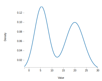
To estimate such distributions without making any strong parametric assumptions, one can use a class of models called kernel density estimators (KDEs). In contrast to a parametric model, where we encode all information on the distribution in their parameters, KDEs are non-parametric and use all data points to form an estimate for a given input value. Since they can learn the shape of the density from the data automatically, they are very flexible and can even learn complicated distributions. To see how this works, let us imagine we some data drawn from above distribution. The density function for above distribution was
> var truePDF = function( x ) {
    return 0.5 * base.dists.normal.pdf( x, 2, 1 ) + 0.5 * base.dists.normal.pdf( x, 9, 2 );
}
and we can draw a sample from it as follows:
> var xs = new Array( 100 );
> inmap( xs, function() { return base.random.randu() > 0.5 ? base.random.normal( 2, 1 ) : base.random.normal( 9, 2 ); } );
The kernel density estimator for an unknown density is defined as
where n is the number observations, K is a so-called kernel function, and h the bandwidth.
We can implement the kernel density estimator as follows:
> function fhat( x, xs, K, h ) {
    var out = 0;
    var n = xs.length;
    for ( var i = 0; i < n; i++ ) {
        out += K( ( x - xs[i] ) / h );
    }
    return out / ( n*h );
}
To gain some intuition into how KDEs work, the next figure shows a kernel density constructed from the five data points located at the black rugs. The KDE works by smoothing each of these observations into a bump (displayed as the dashed red lines), whose shape is determined by the chosen kernel function.
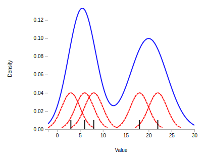
These bumps are then summed together to obtain the KDE, displayed in above plot as the solid blue line. In regions with many data points, the KDE will thus return large values since many bumps were summed together, whereas the KDE will return smaller values for regions with only few observations.
Choosing an appropriate bandwidth is a delicate problem. Many solutions have been proposed, but there is no clear best one. For the sake of simplicity, we will employ a rule of thumb by Silverman that is often used in practice. For the data set above, the rule chooses the value . Let us store this in a variable of said name:
> var h = 1.55054;For the kernel function, we will use the Gaussian kernel:
> var K = base.dists.normal.pdf.factory( 0.0, 1.0 );
We have now everything in place to run generate a kernel density estimate for our data set and compare it with the true underlying distribution. To overlay both the true distribution and our estimate on one plot, let us first create a linearly spaced array of values between 0 and 14 using linspace at whose values we will evaluate the true density as well as our estimator.
> var x = linspace( 0, 14, 200 );
> var y1 = x.map( function( x ) { return truePDF( x ) } );
> var y2 = x.map( function( x ) { return fhat( x, xs, K, h ) } );
> var plt = plot( [x,x], [y1,y2] );
> plt.colors = [ 'red', 'blue' ];
Let us render it into #kde-plot:
> var el2 = document.querySelector( '#kde-plot' );
> el2.innerHTML = vdom2html( plt.render() );Exercises
- For the KDE, instead of choosing the bandwidth via Silverman's rule of thumb, pick both a very large and a very small bandwidth and visualize the results. Observe how the results change. One case should correspond to what is called undersmoothing, the other one oversmoothing. Can you see why?
- In this lab, we have been using the Gaussian kernel, but there are many other available kernel functions. You can use any kernel function with KDE, but different chocies will lead to estimates with different characteristics. The linked Wikipedia article contains a table with a long list of them. Pick one, implement it, and rerun your analysis.
Clustering using KDEs
Cluster analysis subsumes unsupervised learning methods that are concerned with the task of grouping observations together in a way that observations assigned to a common group are similar to each other but distinct from observations assigned to the other groups (called clusters). One of the most popular clustering algorithms is k-means clustering, which is in large part due to its computational efficiency. However, one downside of k-means clustering is that one has to specify the number of clusters that one wishes to retrieve beforehand. We are now going to explore a less known clustring technique, which does not suffer from this shortcoming.
As we can see, the distribution has two modes, one at the value 2 and the other at the value 9. We would expect observations generated from this distribution to roughly form two clusters. A clustering algorithm that can uncover these two clusters, without us having to tell the method that there are two groups, is mode clustering.
Based on the nonparametric kernel density estimate of the distribution, mode clustering proceeds by finding the modes of the distribution via the so-called mean-shift algorithm. Besides estimating the modes of the distribution, the algorithm performs clustering since it reveals what mode each point is attracted to. To perform mode clustering, we have to choose only one tuning parameter, the bandwidth of the underlying kernel density estimator. The mean-shift algorithm works as follows:
Exercises
-
Implement the mean-shift algorithm and obtain the cluster assignments for the data:
> function meanShift( xs, K, h ) {
    var a = copy( xs );
    for ( var j = 0; j < a.length; j++ ) {
        // Code comes here...
    }
    return a;
}
Hint: Instead of checking for convergence at each iteration, in a first pass it might be easier to just run the algorithm for a sufficiently large number of iterations (say a few hundred).
Survey
Did you find this lab useful?
How do you feel about the length of this lab?
Apart from the final exercises, how difficult did you find this lab?
How difficult did you find the exercises for this lab?
Congratulations! We hope that we have successfully introduced you to data science in JavaScript and Node.js and inspired you to continue learning more. Be sure to check out stdlib for more information and follow the project on GitHub and Twitter to receive updates on the latest developments.
Lastly, if you are at Node.js Interactive 2017, go high-five a workshop facilitator and ask for a sticker. :)